Customize your dashboard
With your first Grafana-Athena dashboard in place, you can now start customizing.
Grafana has a tutorial on panels, so we mainly focus on some of the basics. You can also find inspiration via our dashboard playgrounds.
Table of Contents
Templates - getting started
We recommend that you load one of the below templates to get started:
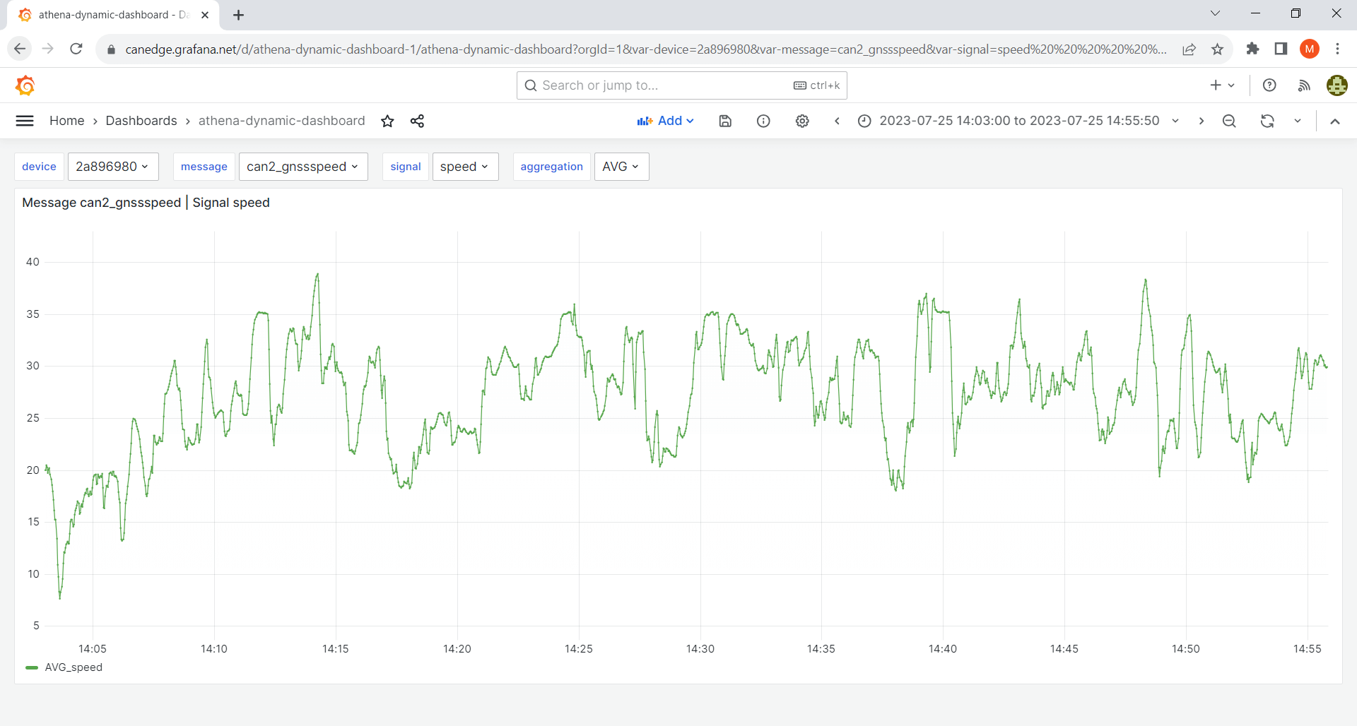
Simple dynamic dashboard

This template works for any CAN/LIN dataset and serves as a good starting point.
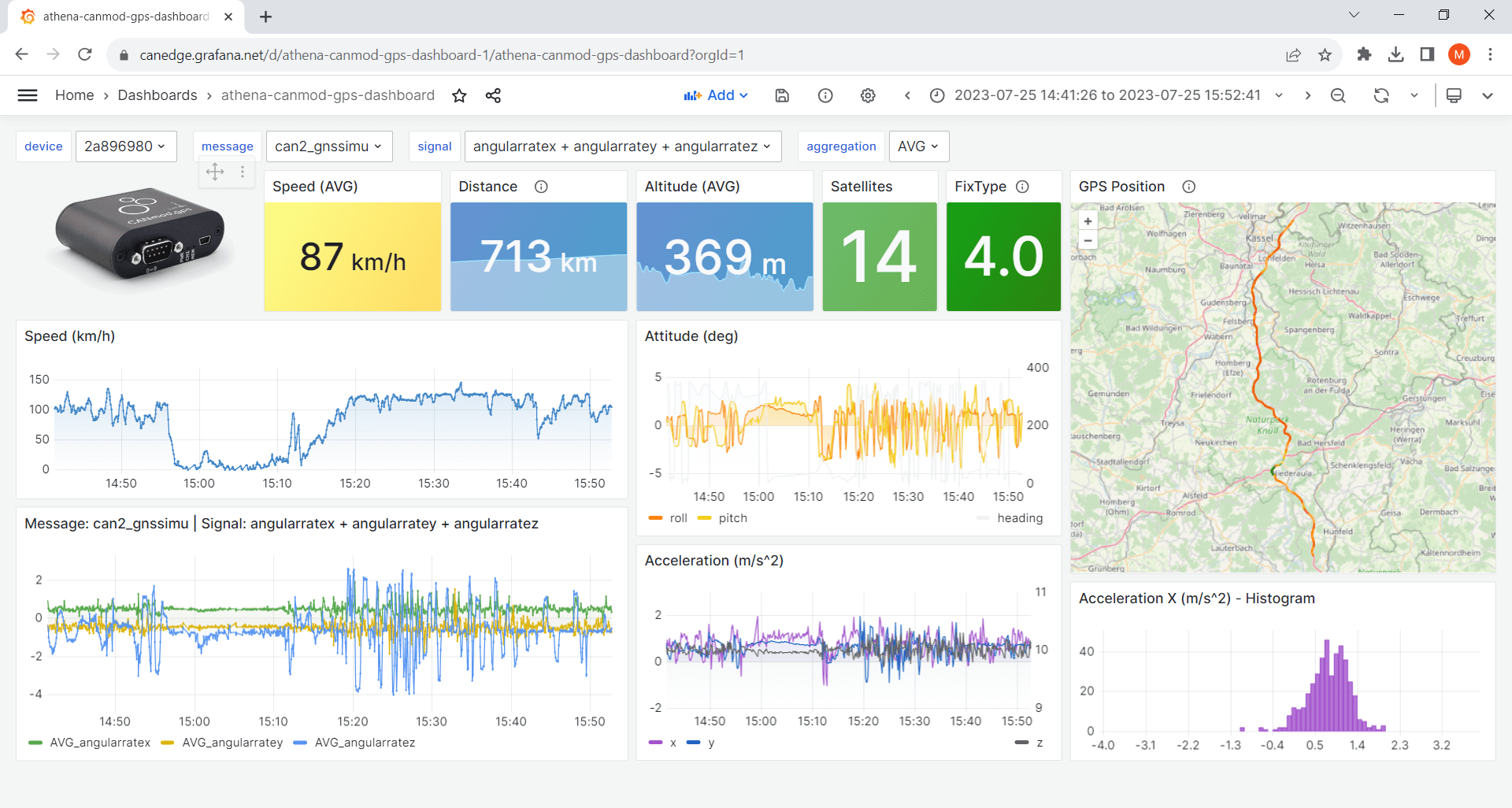
GPS/IMU dashboard

Ideal if you have a CANedge incl. GPS/IMU or CANmod.gps[1].
athena-internal-gps-dashboard template
athena-canmod-gps-dashboard template
Templates - advanced
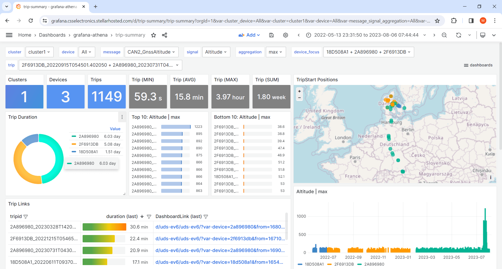
Trip summary dashboard

This template lets you visualize aggregated trip summary tables[7] - ideal for fleets.
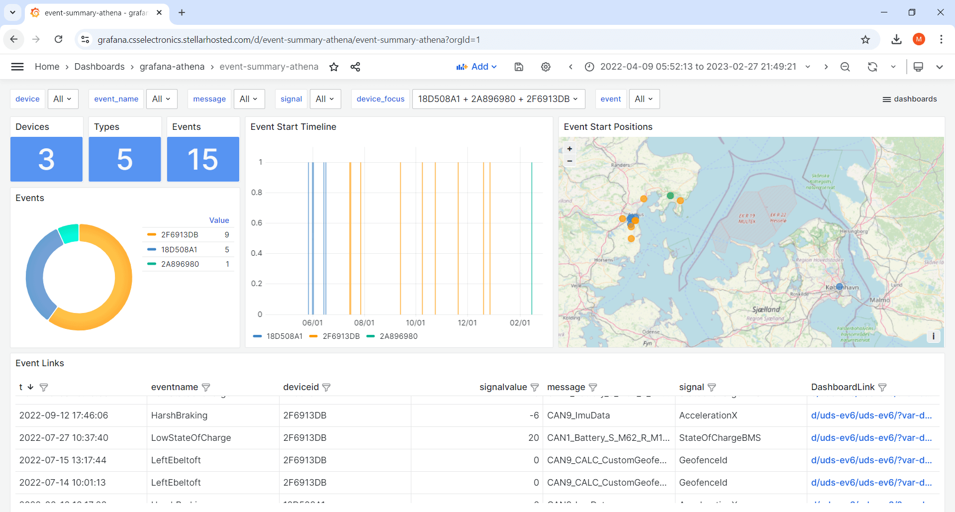
Event summary dashboard

This template lets you visualize event summary tables[7] - ideal for fleets.
Variables
The dashboard templates all use variables. These allow end users of the dashboard to dynamically control certain values, e.g. the device, message and signal.
Note
By default, the device dropdown lists all your output bucket device IDs with a meta prefix (extracted from the device.json files in the input bucket)[3]
Create a new panel
The Athena data source uses standard SQL to query data.
To create a new panel, click ‘Add/Visualization’ (top middle) and paste a query as below:
SELECT
    $__timeGroup(t, $__interval) as time,
    AVG(mysignal) as AVG_mysignal
FROM
    tbl_${device:csv}_mymessage
WHERE
    date_created BETWEEN $__rawTimeFrom('yyyy/MM/dd') AND $__rawTimeTo('yyyy/MM/dd')
    AND
    $__timeFilter(t)
GROUP BY
    $__timeGroup(t, $__interval)
ORDER BY
    time asc
Simply replace mymessage with your message name (e.g. can2_gnssspeed) and mysignal with a signal (e.g. speed) from that message[2]. You can also query multiple signals/aggregations:
AVG(mysignal1) as AVG_mysignal1, MAX(mysignal2) as MAX_mysignal2
Transformations
Grafana transformations allow you to create e.g. calculated signals, filters and more. In the dashboard templates, transformations are e.g. used to filter which signals are shown in certain panels - as well as scale speed (m/s) to speed (km/h).
Note
We recommend to review Grafana’s excellent transformations docs for details
Transformations are done on the results of your SQL queries - not on the backend data. To create backend calculations, you should instead modify the SQL query (more below).
Importantly, transformations can be chained - leading to an almost limitless number of possibilities.
Below we list examples of useful Grafana transformations:
Merge
A challenge when working with CAN data is the use of different time rasters per CAN message in the backend, which normally makes it hard to operate on signals across messages. However, the aforementioned Athena queries resample your backend data to a common time raster on-the-fly. As a consequence, you can add multiple SQL queries in the same panel and apply a ‘merge’ operation to operate on cross-message signals in a single table with a shared time raster.
Add field from calculation
This allows you to create calculated signals via various math operations, across one or multiple signals (incl. across messages via merging).
Filter data by values
This is great for excluding certain values from your panels (incl. e.g. null values or outliers).
Transpose
This pivots your data frame, which is often useful in restructuring your data in a specific way.
Advanced SQL queries
For many use cases, the default SQL queries in our dashboard templates will suffice for visualizing your data - in particular when combined with the powerful Grafana transformations.
However, some calculations need to be done on the ‘original’ data in the Parquet data lake at the backend. Luckily, this can often be done via a custom SQL query.
Below we list some tips on creating custom Athena SQL queries:
Use our default queries as inspiration
The default queries do a lot of heavy-lifting that you should re-use in custom queries, in particular in regards to the dynamic behavior (Variables, timestamp functions) and filtering (as per the WHERE section). In addition, make sure to always return a result that is ‘aggregated’ (e.g. through AVG, MAX, SUM, …) to avoid returning e.g. millions of observations to Grafana.
Leverage ChatGPT and similar tools
In our experience, tools like ChatGPT can help construct complex queries with great results. If you are not an SQL expert, this is a practical method to generate queries that you can immediately test out. Make sure to provide our default queries as a starting point for the development.
Use sub queries for delta time operations
In CAN/LIN analysis you often need to analyse data with respect to time durations i.e. delta time. This is e.g. useful to understand how much time a vehicle spends charging, with active DTCs or at different RPM levels. To do this, you can use WITH sub queries and DATE_DIFF operations. For inspiration, see the ‘duty cycle’ panel in our j1939-truck-athena dashboard playground.
Perform cross-table joins
In SQL, you can query data across multiple tables (i.e. different CAN messages in our context) by using JOIN statements, allowing you to perfrom backend calculations of signals across messages. While powerful, such operations are drastically slower vs. returning resampled data from the two tables in parallel. We therefore recommend to always consider if your cross-table signal calculations could be done by using Grafana transformations on the resampled responses of multiple queries.
Custom signals, trip summaries and alerts
In some cases, the combination of Grafana’s transformations and Athena’s SQL queries will still not suffice to enable the analysis you are looking to achieve.
For example, if you need to create complex SQL queries with many JOIN statements, you dashboard will become slow. Here you can instead create custom signal tables in your backend.
If your goal is to look at trip summaries/benchmarking across devices/messages we recommend to see our section on creating trip summary tables.
Further, you may want to set up event notifications/alerts. You can do this within your Lambda and visualize ‘event summary dashboards’ via Grafana-Athena.
These topics are covered in our advanced topics section.
| [1] | These templates use Grafana’s powerful Geomap panel (specifically the ‘Route’ layer). You can add multiple layers, incl. markers, heatmaps etc. as described in the Geomap docs. The template panel executes two queries (position, speed) from separate tables, then merges the results to allow using the speed result as color coding for the route. |
| [2] | If in doubt on message/signal names, you can browse them via the variable dropdowns. |
| [3] | If you wish to update the meta prefix, simply update the relevant device Configuration File to trigger a change in the device.json once synced. After this, you can re-run the Glue script to update the mapping table queried by the device Variable dropdown. If you prefer to only display the device IDs, simply remove the metaname AS text section of the query (or hardcode the list entirely using the ‘Custom’ Variable type). |
| [4] | This is enabled by default in the dashboard templates |
| [5] | Data source caching implies that if a query has been run previously in Grafana it will be cached for a period - implying that no query is made against AWS Athena. This adds an extra layer of speed and cost reductions. However, it can cause confusion if you’re actively expanding your data lake with new devices/tables - so consider enabling this as you enter ‘production’. |
| [6] | This is an important trick to avoid querying the same data twice. Simply select -- Dashboard -- as data source in a panel, then use ‘Transform data/filter by name’ to control which of the already-queried signals to display in the new panel. This is particularly useful as you can query multiple signals for a given message in one panel - and then visualize them across multiple panels. You can see this used in the GPS/IMU templates for e.g. speed, satellites/fix and acceleration. |
| [7] | (1, 2) The trip summary template works best if you align the color coding of devices across plots. We provide a small 'device-color-generator' script that can be used in facilitating this. This script is provided without support. |