Customize your dashboard
With your first Grafana-Athena dashboard in place, you can now start customizing.
Grafana has a tutorial on panels, so we mainly focus on some of the basics. You can also find inspiration via our dashboard playgrounds.
Table of Contents
Templates - getting started
We recommend that you load one of the below templates to get started:
Simple dynamic dashboard
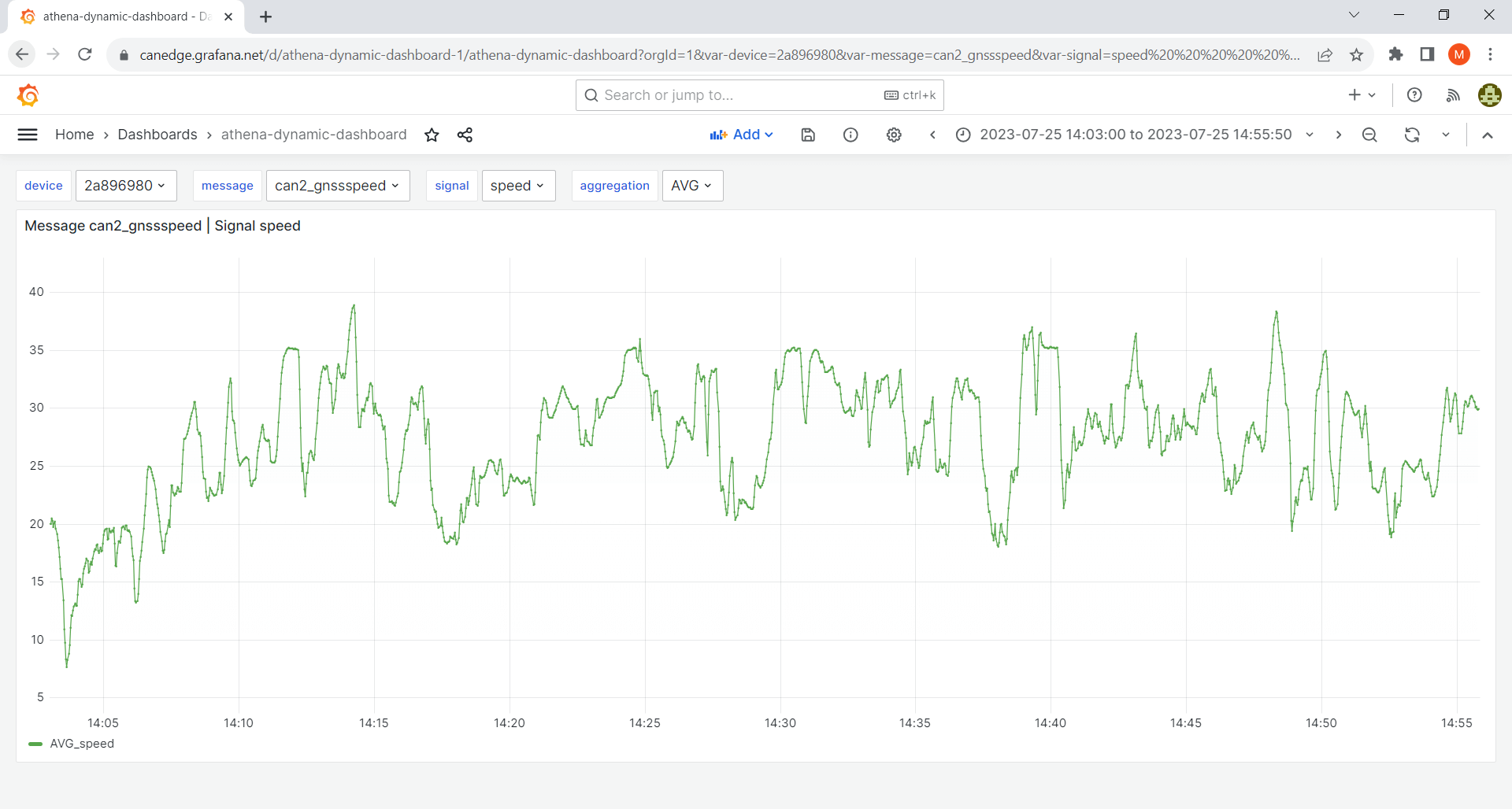
This template works for any CAN/LIN dataset and serves as a good starting point.
GPS/IMU dashboard
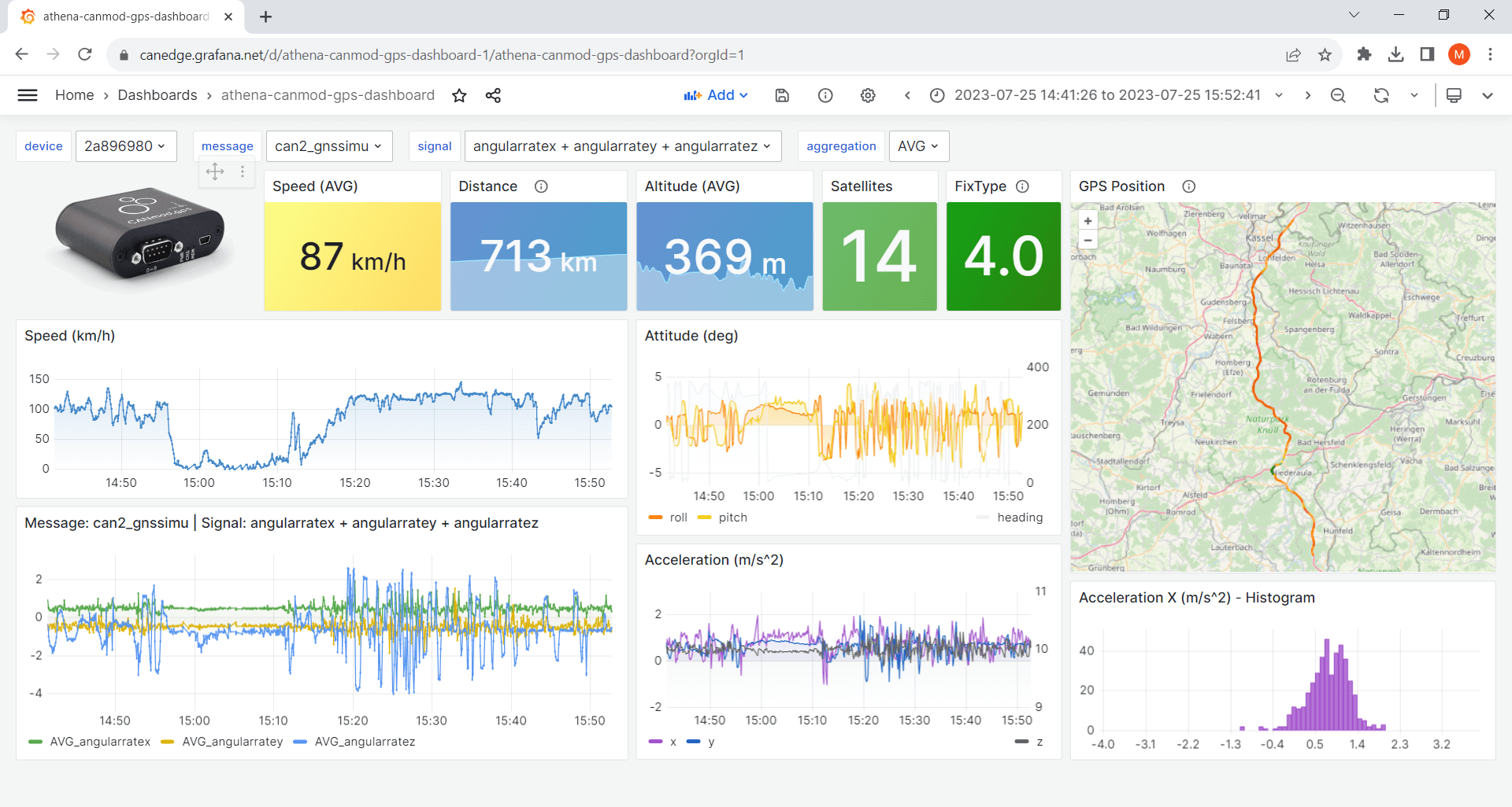
Ideal if you have a CANedge incl. GPS/IMU or CANmod.gps[1].
athena-internal-gps-dashboard template
athena-canmod-gps-dashboard template
Templates - advanced
Trip summary dashboard
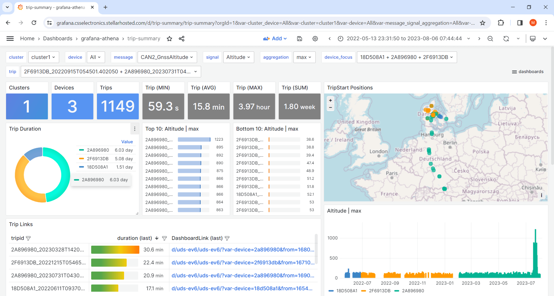
This template lets you visualize aggregated trip summary tables[6] - ideal for fleets.
Variables
The dashboard templates all use variables. These allow end users of the dashboard to dynamically control certain values, e.g. the device, message and signal.
Create a new panel
The Athena data source uses standard SQL to query data.
To create a new panel, click ‘Add/Visualization’ (top middle) and paste a query as below:
SELECT
    $__timeGroup(t, $__interval) as time,
    AVG(mysignal) as AVG_mysignal
FROM
    tbl_${device:csv}_mymessage
WHERE
    date_created BETWEEN $__rawTimeFrom('yyyy/MM/dd') AND $__rawTimeTo('yyyy/MM/dd')
    AND
    $__timeFilter(t)
GROUP BY
    $__timeGroup(t, $__interval)
Simply replace mymessage with your message name (e.g. can2_gnssspeed) and mysignal with a signal (e.g. speed) from that message[2]. You can also query multiple signals/aggregations:
AVG(mysignal1) as AVG_mysignal1, MAX(mysignal2) as MAX_mysignal2
Transformations
Grafana transformations allow you to transform your data to create e.g. calculated signals, filters and more. In the GPS/IMU templates, transformations are e.g. used to filter which signals are shown in certain panels - as well as scale speed (m/s) to speed (km/h).
Optimize performance
- Query result reuse: We recommend to enable this in panels to ‘cache’ queries[3]
- Datasource caching: Optionally enable caching in your data source[4]
- Reuse signals: Use existing panels as data sources to e.g. reuse signals in new panels[5]
| [1] | These templates use Grafana’s powerful Geomap panel (specifically the ‘Route’ layer). You can add multiple layers, incl. markers, heatmaps etc. as described in the Geomap docs. The template panel executes two queries (position, speed) from separate tables, then merges the results to allow using the speed result as color coding for the route. |
| [2] | If in doubt on message/signal names, you can browse them via the variable dropdowns. |
| [3] | This is enabled by default in the dashboard templates |
| [4] | Data source caching implies that if a query has been run previously in Grafana it will be cached for a period - implying that no query is made against AWS Athena. This adds an extra layer of speed and cost reductions. However, it can cause confusion if you’re actively expanding your data lake with new devices/tables - so consider enabling this as you enter ‘production’. |
| [5] | This is an important trick to avoid querying the same data twice. Simply select -- Dashboard -- as data source in a panel, then use ‘Transform data/filter by name’ to control which of the already-queried signals to display in the new panel. This is particularly useful as you can query multiple signals for a given message in one panel - and then visualize them across multiple panels. You can see this used in the GPS/IMU templates for e.g. speed, satellites/fix and acceleration. |
| [6] | The trip summary template works best if you align the color coding of devices across plots. We provide a small 'device-color-generator' script that can be used in facilitating this. This script is provided without support. |